
Creative Evolution: Learn Abstract Painting With Focus on Color, Design, and Personal Expression
Feb 06, 2026
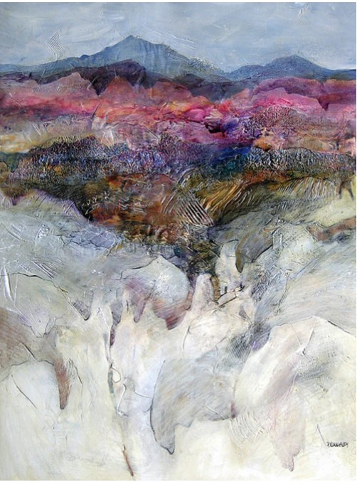
Abstract painting reaches its full potential when emotion, structure, and individuality exist in balance. Choosing to learn abstract painting with focus on color, design, and personal expression moves artists away from random experimentation toward intentional creativity.
Color communicates emotion, design provides visual order, and personal expression gives authenticity to every mark. When these elements work together, abstraction becomes confident, expressive, and visually resolved—while remaining open, dynamic, and deeply personal.
Explore Art and Success programs to learn abstract painting with focus on color, design, and personal expression.
How Does Focusing on Color Strengthen Abstract Painting?
Emotional Direction Through Palette Control
Color establishes emotion before shape or texture is understood. Warm tones convey vitality and energy, while cool tones evoke calm and reflection. Purposeful palette choices guide emotional response and ensure clarity throughout layered abstraction.
Restricting or expanding color options based on mood maintains emotional consistency and prevents confusion, allowing viewers to connect instantly with the artwork’s emotional depth.
Depth Creation Using Contrast
Contrast introduces space and movement in abstract compositions. Light versus dark, bold versus muted, and warm versus cool create visual hierarchy and guide the eye across the surface.
Balanced contrast adds depth without realism, preserves expressive freedom, and prevents visual overload by clearly defining focal and supporting areas.
Visual Clarity in Complex Layers
Without color discipline, layered abstraction can feel chaotic. Repeating selected colors across layers unifies textures, marks, and materials. Strategic color placement maintains clarity even in dense, complex compositions.
Strong color relationships allow artists to experiment freely while preserving unity, rhythm, and compositional balance.
Temperature Balance for Spatial Interest
Warm colors advance visually, while cool colors recede, creating depth without perspective lines. Temperature contrast adds spatial movement, emotional tension, and serenity simultaneously.
This balance keeps abstraction fluid, expressive, and visually engaging across the entire surface.
Rhythm Supported by Color Repetition
Repeating colors generates rhythm and movement, linking different areas of the canvas into a unified narrative. Subtle color echoes guide the viewer’s eye and eliminate fragmentation.
Repetition enhances harmony, allowing varied textures and marks to coexist with continuity and expressive energy.
Emotional Consistency Across the Canvas
Random color shifts blur emotional intent. Controlled palettes maintain a single emotional language—whether calm, energetic, or contemplative—strengthening storytelling and viewer connection.
Art and Success offers engaging art programs that support expressive growth.
How Does Design Support Freedom in Abstract Painting?
Balance Across Visual Weight
Balance distributes attention evenly across the canvas using color fields, detail, and open space. Adjusting scale, placement, and intensity stabilizes expressive marks without overwhelming the viewer.
Structure Beneath Spontaneity
Design principles provide subtle organization beneath expressive motion. Alignment, spacing, and flow support spontaneity while offering a visual safety net that encourages confident risk-taking.
Movement Guided by Alignment
Diagonal flows, vertical energy, and circular motion guide viewers across the surface. Intentional movement keeps abstraction dynamic, immersive, and visually alive.
Unity Through Repetition
Repeating shapes, textures, or motifs builds cohesion without limiting creativity. Rhythm and contrast coexist, allowing expressive complexity with compositional integrity.
Negative Space for Visual Breathing Room
Negative space allows dense textures and bold marks to stand out. Purposeful openness prevents visual fatigue and transforms empty space into an active design element that enhances balance and clarity.
Color, Design, and Expression Overview Table
| Element | Role in Abstract Painting | Creative Benefit |
|---|---|---|
| Color emotion | Mood communication | Emotional clarity |
| Design balance | Structure | Visual stability |
| Personal marks | Identity | Artistic voice |
| Contrast | Depth | Visual movement |
| Harmony | Unity | Cohesive surfaces |
| Rhythm | Flow | Viewer engagement |
FAQs on Learning Abstract Painting
Is abstract painting suitable for beginners?
Yes. Abstract painting encourages exploration without rigid rules, making it ideal for skill development at any level.
Why is color so important in abstraction?
Color conveys emotion and guides the eye, forming the foundation of abstract expression.
Do design principles limit creativity?
No. Design principles enhance clarity and provide freedom by supporting intentional expression.
How does personal expression improve?
Consistent practice, reflection, and experimentation naturally strengthen artistic voice.
Conclusion
Abstract painting thrives when creativity is guided by intention. Choosing to learn abstract painting with focus on color, design, and personal expression builds emotional clarity, visual balance, and authentic artistic identity.
Color delivers emotion, design structures energy, and personal expression brings honesty to every surface. Art and Success is the ideal place to master expressive abstract painting and develop lasting creative confidence.
FREE GUIDE
Five Must Have Studio Tools Each Under $20
Sign up now to get instant access to the free guide that reveals the 5 most important tools that I always have by my side!
We hate SPAM. We will never sell your information, for any reason.
