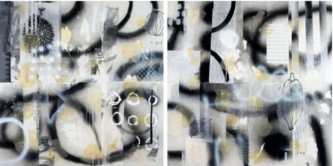
How to Combine Color and Design in Mixed Media Painting for Expressive Abstract Art
Feb 06, 2026Color and design work together like rhythm and melody in mixed media painting. When intentionally combined, they transform layered surfaces into visually engaging stories. Understanding how to combine color and design in mixed media painting allows artists to move from instinctive creation to purposeful expression.
Through powerful palettes, harmonious compositions, and structured freedom, abstract artwork gains depth, balance, and emotional resonance—without sacrificing spontaneity or creative voice.
Take part in Art and Success courses to enhance creativity, confidence, technique, vision, and career development.
How Can Color and Design Work Together to Create Expressive Abstract Paintings?
Color-Led Composition Structure
Composition can begin with color before shape emerges. Large color fields establish visual weight and direction, guiding subsequent layers. Balance develops naturally through thoughtful color placement, allowing intuitive creation while maintaining visual control.
Strategic color blocks act as anchors, uniting textures and marks. Color becomes the foundation of design rather than a final decorative choice.
Layered Harmony Through Repetition
Repeating colors creates unity across complex surfaces. Even when materials change, repetition establishes rhythm and cohesion. This approach ensures collage, paint, and mark-making coexist harmoniously.
Subtle color echoes guide the viewer’s eye without overpowering the composition, supporting expressive freedom without visual overload.
Contrast for Visual Hierarchy
Contrast plays a critical role in abstraction. Variations between light and dark, dull and bright, naturally attract focus. Controlled contrast strengthens both color and design while maintaining emotional clarity.
Balanced contrast prevents overcrowding and preserves readability, allowing exploration without confusion.
Emotional Tone Through Palette Control
Every palette carries emotional weight. Harmonious tones evoke calm or vitality, while intentional discord creates tension. Palette control aligns emotional intent with visual organization, ensuring expressive consistency.
Viewers often feel the mood of an abstract piece before analyzing texture or form.
Spatial Balance Using Warm and Cool Tones
Warm colors advance visually, while cool colors recede, creating depth without realism. Temperature contrast produces spacious, dynamic abstract compositions.
Depth emerges naturally through color temperature rather than literal perspective.
Texture Emphasized Through Color Choice
Intentional color choices enhance texture. Bright contrasts highlight rough surfaces, while softer hues support subtle textures. Color influences how texture interacts with the eye, reinforcing design clarity.
Negative Space for Visual Breathing Room
Negative space counters crowded abstraction by offering visual rest. Open areas highlight focal points and preserve balance, ensuring sustained viewer engagement.
Empty space becomes an active design element rather than wasted surface.
Scale Variation for Dynamic Movement
Large color blocks paired with fine details create movement and hierarchy. Scale variation guides the eye and sustains visual energy throughout the composition.
Unified Palettes Across Mixed Materials
Because pigments react differently across surfaces, a limited palette ensures cohesion. Unified color choices integrate diverse materials into a purposeful whole.
Design Frameworks for Creative Freedom
Design principles provide structure without restricting expression. Balance, rhythm, and alignment guide intuitive choices and support confident experimentation.
Movement Guided by Color Flow
Directional marks, gradients, and transitions lead the viewer through the surface. Color flow creates motion, keeping abstract work alive and engaging.
Expressive Risk Supported by Harmony
Bold decisions succeed when harmony underlies the composition. Balanced palettes and strong design encourage risk without sacrificing cohesion.
Explore Art and Success programs to elevate creativity, confidence, technique, and career growth worldwide.
Color and Design Reference Table
| Strategy | Purpose | Artistic Benefit |
|---|---|---|
| Repeated palettes | Unity | Cohesive surfaces |
| Warm–cool balance | Depth | Spatial movement |
| Contrast control | Focus | Visual clarity |
| Negative space | Balance | Reduced clutter |
| Scale variation | Energy | Dynamic rhythm |
| Texture emphasis | Interest | Tactile impact |
FAQs on Color and Design in Mixed Media Painting
What is the importance of color in abstract mixed media painting?
Color organizes composition, conveys emotion, and integrates diverse materials into a unified visual language.
Can strong design coexist with expressive freedom?
Yes. Design principles enhance expression by providing clarity and balance during experimentation.
What is the benefit of color harmony in abstract art?
Harmony transforms bold decisions into purposeful, cohesive statements rather than disorder.
Is a limited color palette better for mixed media painting?
Limited palettes increase unity while allowing variety through texture and layering.
Conclusion
Color and design are powerful allies in abstract expression. When combined intentionally, they create emotionally compelling, balanced mixed media artwork. Applying thoughtful color-design strategies enables confident experimentation and long-term artistic growth.
Connect with Art and Success to continue your journey toward expressive mastery.
FREE GUIDE
Five Must Have Studio Tools Each Under $20
Sign up now to get instant access to the free guide that reveals the 5 most important tools that I always have by my side!
We hate SPAM. We will never sell your information, for any reason.

