
How to Combine Color and Design in Mixed Media Painting for Strong, Expressive Abstract Art
Dec 18, 2025What Does Combining Color and Design Mean in Mixed Media Painting?
The key to knowing how to combine color and design in mixed media painting is to understand what it entails before implementing techniques. This mix is concerned with purpose - to make the color emotive but to leave the design to systematize that emotion visually.
- Color as Emotional Communication
The color is likely to be the first emotional reaction of viewers. For excitement, tension, or joy, strong saturated colors can be used, whereas the lighter ones can imply peace, contemplation, or richness. Feelings are intentional when the decision of colors is determined by the design, not done by coincidence. - Design as the Silent Guide
Design is silent about the experience of color. It regulates the placement of colors, the amount of space they occupy, and how they play off textures and shapes. The absence of design, even in beautiful colors, can make them look scattered or overwhelming. - Layering With Visual Awareness
Mixed media is dependent on layering. The visual balance and harmony through color and design in painting must be considered in relation to the functionality of each layer in the composition, not as afterthoughts. - Freedom Supported by Structure
Freedom is glorified in abstract art, though the color and design strategies for expressive abstract painting give soft obstruction. This balance permits expressiveness, yet the picture has a visual basis. - Creating Meaning Through Combination
The harmony of color, emotion, and thoughtful design makes the artwork easier to communicate with and connect with the viewer.
Artists who wish to attain this balance with confidence usually pursue Art and Success, in which a sound artistic background supports exploration of art.
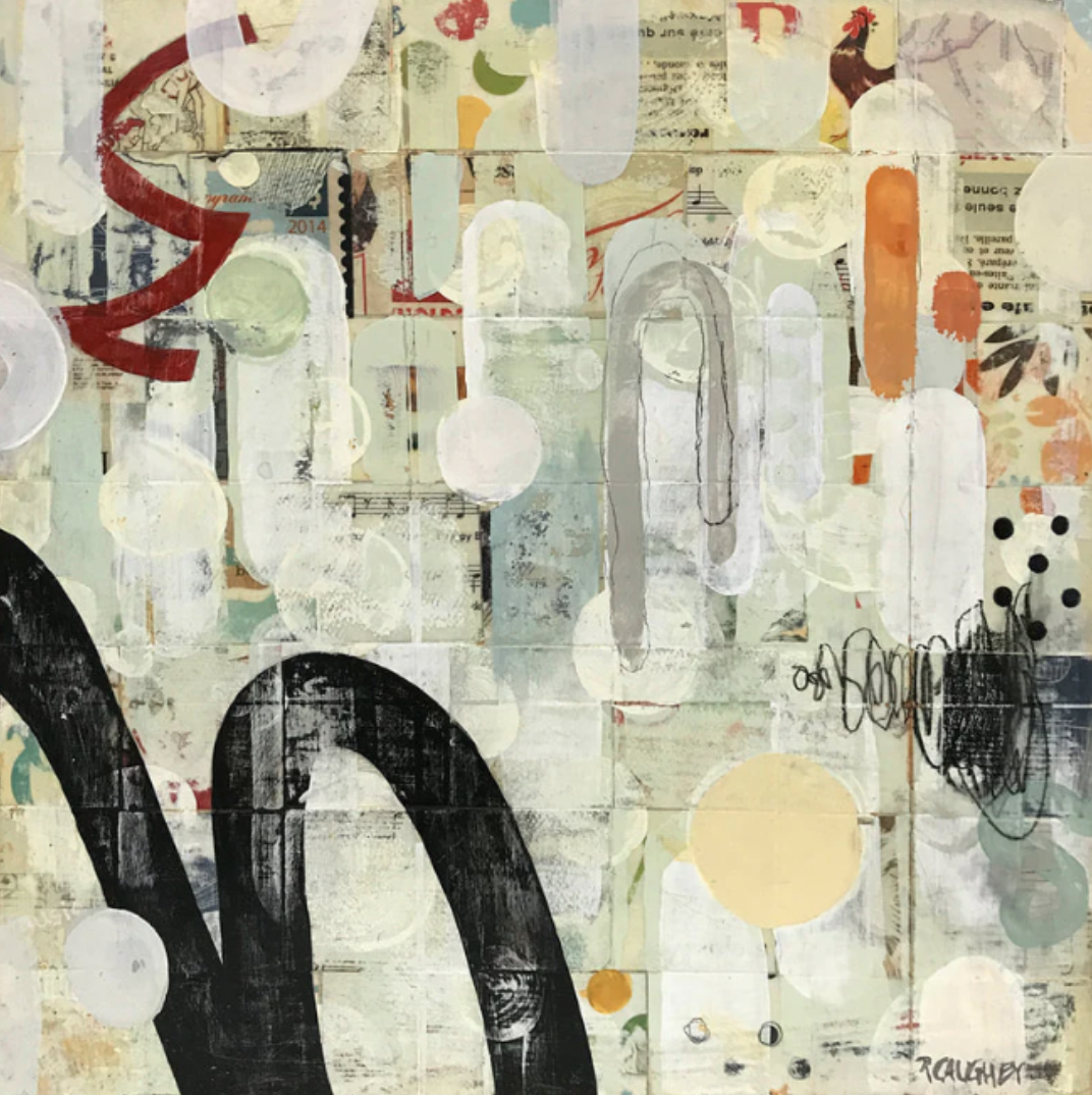
Using Color and Design to Create Visual Balance and Harmony
The visual balance and harmony through color and design are key to the feeling of completeness, comfort, and interest in the artwork, even when it is bold and expressive.
- Balancing Strong and Soft Colors
Saturated colors are highly saturated and therefore draw attention. Combining them with softer or neutral-colored items gives the eye a place to rest and prevents the painting from looking heavy. - Repeating Colors to Build Unity
It is important to repeat some colors across the various parts to bind the layers and materials. This repetition adds cohesion, an essential element in mixed-media compositions. - Using Space as a Design Element
Unoccupied spaces or spaces with less noise are equally significant as described spaces. Space provides breathing of colors and improves universal harmony. - Applying Contrast With Intention
Contrast is exciting, but excessive contrast may seem hectic. Considerable contrast brings out important areas without overpowering the viewer. - Guiding the Eye Through Color Placement
The placement of the color creates movement and helps the viewer move through the work rather than keeping concentration on a single point.
It is much easier to learn to balance energy and calm by playing with color and design, with expert feedback available through Art and Success.
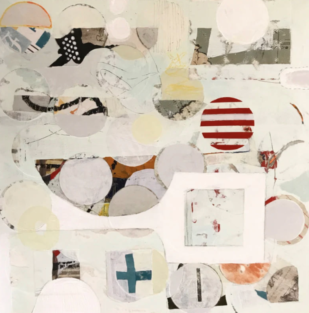
What Are Color and Design Strategies for Expressive Abstract Paintings?
The artistic abstract paintings are nurtured by emotion, yet the presence of solid strategies ensures they will not lose their visual strength and unity. There must be visual balance and harmony through color and design in paintings.
The best color and design strategies for expressive abstract painting are as follows:
- Limiting the Color Palette for Clarity
A limited color palette helps achieve harmony and maintain the expression's focus. It enables emotions to be multiplied without visual distraction. - Building Emotional Depth Through Layers
The use of colors in layers in a gradual manner makes it rich and complex. Every layer contributes to the artwork's emotional narrative. - Designing Around a Clear Focal Area
A point of interest provides a starting point to the viewer. Even minor areas of focus add a sense of direction to expressive works. - Letting Texture Influence Color Decisions
The texture alters the appearance of color. A rough texture of the color's color, and smooth grounds make it brighter and more contrasting. - Balancing Intuition With Design Awareness
The expression of the mind is impulsive, and the design principles are perfect. This equilibrium will make the artists feel confident rather than unsure.
At Art and Success, these color and design strategies for expressive abstract painting are fully taught in their masterclass, and artists learn to use emotion in their design and color intentionally. They also learn how to combine color and design in mixed media painting.
Applying Color and Design Together in Real Mixed Media Practice
Application is where real development occurs in theory. Understanding how to combine color and design in mixed media painting helps to turn creative uncertainty into a sure decision-making process.
- Starting With a Loose Color Direction
The general color plan is also a guideline, but not restrictive to creativity. It maintains experimentation in line with the artwork's mood. - Adjusting Design as Layers Evolve
Paintings in mixed media change with time. Restructuring other design decisions ensures balance as emerging components are introduced. - Using Color Accents for Emotional Impact
Even little deliberate accents can change the whole atmosphere of a picture and create the emphasis where it is necessary. - Stepping Back to Assess Balance
Frequent pauses will enable artists to view the entire piece of artwork and make critical corrections. - Knowing When to Stop
Mastery of design incorporates completion identification. The correct time to end gives the statement clarity and emotional power.
Individual artists seeking practical instruction in implementing these steps tend to accelerate their learning of visual balance and harmony through color and design in painting through formal opportunities at Art and Success.
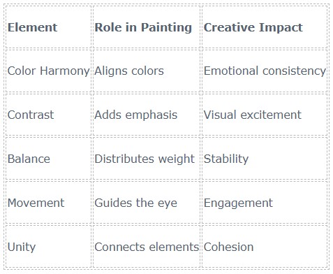
Table: Color and Design Essentials
Conclusion
Understanding how to combine color and design in mixed media painting enables abstraction to be expressive, well-balanced, and very purposeful. Working together, the color, emotion, and design structure make the artwork more effective and self-assured. Such color and design strategies for expressive abstract painting help artists avoid guesswork and experience the creative process more clearly. To the artists who want to be inspired, guided, and develop their artistic abilities, Art and Success provides the artistic aura in which both the freedom and the framework fall on the same plane, enabling artists to bring expressive concepts to life and make them artistically appealing.
FAQs
Why is combining color and design important in mixed media painting?
The use of color with design makes the artwork look purposeful and evenly balanced. Color evokes emotion, and design brings order to the visual components of abstract paintings, making them more attractive and harmonious.
Can beginners learn how to combine color and design easily?
Yes, amateurs can learn these ideas with ease. The use of simple colors and a basic design sensibility will help reduce confusion and build confidence as one experiment with mixed media and abstract painting.
Does focusing on design restrict creative freedom?
No, design does not impair creativity. It enhances creative freedom by providing organization, so artists can capture their thoughts with precision without feeling overwhelmed or cluttered.
FREE GUIDE
Five Must Have Studio Tools Each Under $20
Sign up now to get instant access to the free guide that reveals the 5 most important tools that I always have by my side!
We hate SPAM. We will never sell your information, for any reason.
