
Learn Color Theory and Design for Mixed Media & Abstract Painting
Feb 06, 2026Color determines the experience, memory, and emotional interpretation of abstract and mixed media artwork. Without structure, compositions may feel disjointed or unfinished. Learning color theory and design for mixed media painting introduces clarity, balance, and confidence into every creative decision.
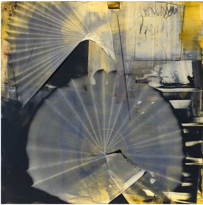
Understanding color harmony and design principles for abstract painting helps artists become aware of layers, textures, and movement. These foundations unlock expressive freedom, making abstract work visually stimulating, emotionally evocative, and artistically sophisticated.
How Does Color Theory Strengthen Mixed Media Painting Foundations?
Solid Understanding of Color Relationships
Layered compositions rely on color wheels, complementary contrasts, split complements, and analogous harmonies. In mixed media painting, these relationships prevent visual confusion among textures, papers, and painted surfaces. Warm and cool colors support cohesive visual flow rather than competing with one another.
Emotional Impact Through Color Choices
Color communicates emotion instantly and subconsciously. Reds convey intensity, blues bring calmness, and earthy neutrals anchor expressive marks. Strategic emotional color choices, combined with strong design principles, allow abstract artworks to resonate deeply while maintaining clarity.
Improved Contrast and Focal Balance
Contrast establishes visual hierarchy in complex compositions. Light against dark or vibrant areas against subdued spaces naturally guide the viewer’s attention. This balance prevents visual congestion and ensures focal points remain clear even through dense layers.
Confident Layering Decisions
Layering depends on understanding undertones, transparency, opacity, and color reactions. Artists can glaze, scrape back, or collage without muddy effects. Color knowledge turns experimentation into intentional, guided decision-making.
Better Material Integration
Mixed media surfaces respond differently to pigment, ink, fabric, and found materials. Color theory helps predict absorption, reflection, and blending, allowing all elements to work in harmony across unpredictable surfaces.
Stronger Visual Storytelling
Rhythm, contrast, and color progression guide the viewer’s gaze through layers and textures. Color harmony strengthens emotional direction, cohesion, and meaning in non-representational art.
Why Do Design Principles Matter in Abstract Color Exploration?
Composition Clarity in Abstraction
Design principles organize expressive spontaneity. Balance, repetition, alignment, and spacing transform intuitive marks into intentional, visually pleasing compositions.
Rhythm and Movement Control
Repeating colors, shapes, or gestures creates rhythm and sustained engagement. Controlled rhythm unifies brushwork into a cohesive visual narrative.
Unity Across Complex Layers
Unity brings diverse textures and materials into one visual language. Repetition of color families or shapes creates complexity without confusion.
Effective Use of Negative Space
Negative space offers visual rest, highlights focal points, and enhances movement. This restraint balances expressive detail with visual calm.
Proportion and Scale Awareness
Varying scale adds depth and drama. Large color areas paired with intricate details guide eye movement and establish hierarchy.
Intentional Experimentation
Understanding structure allows artists to bend or break rules confidently. Color harmony supports bold experimentation while preserving clarity and coherence.
Classes by Art and Success help you achieve mastery in abstract painting.
Color Harmony Reference Table
| Principle | Purpose | Best Use Case |
|---|---|---|
| Complementary colors | Strong visual contrast | Dynamic abstract focal points |
| Analogous colors | Smooth transitions | Calm layered compositions |
| Triadic schemes | Visual energy | Balanced expressive abstraction |
| Monochromatic palettes | Strong unity | Textured mixed media surfaces |
| Warm vs cool balance | Depth and dimension | Spatial abstract compositions |
| Neutral grounding | Visual rest | High-energy abstract work |
FAQs on Color and Design for Abstract Painting
What does beginning color theory learning in abstract art involve?
Understanding basic color relationships, temperature, and emotional response builds confidence and prepares artists for advanced palette strategies.
Does abstract painting use traditional design principles?
Yes. Design principles provide clarity, balance, and movement even within expressive abstraction.
Why is color theory important in mixed media art?
Different materials affect color behavior, making theory essential for visual harmony.
Does color harmony
FREE GUIDE
Five Must Have Studio Tools Each Under $20
Sign up now to get instant access to the free guide that reveals the 5 most important tools that I always have by my side!
We hate SPAM. We will never sell your information, for any reason.
