Learn Color Theory and Design for Mixed Media Painting: A Deep, Practical Guide to Abstract Expression
Dec 18, 2025
What Is Color Theory in Mixed Media Painting?
- Primary Colors as the Foundation of All Creative Choices
Red, blue, and yellow, which are primary colors, are the basis for all decisions an artist makes about color. To learn color theory and design in mixed media painting, where layers of paint, ink, and texture overlap, knowledge of the behavior of primary colors helps the artist mix without confusing the work. This knowledge leads to less frustration and enables a sense of control over experimentation rather than chaos. - Secondary and Tertiary Colors That Add Emotional Depth
Once the primaries are mixed, they form secondary and tertiary colors that enrich and personalize the abstract painting. Such color associations make layer transitions smoother and make the various materials appear to belong together rather than feel alienated. - Warm and Cool Colors That Shape Emotional Impact
Reds and oranges are warm colors; thus, they will always feel active and expressive, while blues and greens are cool colors; hence, they will be calm and balanced. This knowledge of this emotional influence can enable artists to deliberately direct how viewers experience the artwork's emotional side. - Value as the Key to Visual Depth and Focus
The value is a feature of a color's lightness or darkness. Altering strategic value is achieved by contrasting to bring out what is important and add depth to mixed-media artwork, avoiding a two-dimensional canvas. - Color Interaction Across Different Surfaces and Textures
Colors vary depending on surface texture, background color, and surrounding colors. It is a prerequisite that mixed media artists learn to observe such interactions, and this is one of the key concerns of formal learning programs to understand color harmony and design principles for abstract painting. Art and Success is the best place for it!
Building Strong Design Foundations for Abstract Art
Mastering color and design techniques for abstract painting is not easy. Find out how you can do it!
- Balance That Feels Comfortable, Not Forced
In abstract art, balance is achieved by distributing visual weight through color intensity, textures, and the placement of forms. Even a seemingly spontaneous composition is stable and well-balanced. - Contrast That Keeps the Viewer Engaged
The light and shadow, smooth and roughness, bold and subtle elements contrast make the artwork visually interesting. Even the intense colors may be dead without the contrast. - Movement That Encourages Visual Exploration
Movement is acquired through the repetition of lines, shapes, or color tracks that trace the viewer's eye across the canvas. This makes the viewer interested and motivates them to search the whole piece of art. - Focal Points That Give the Artwork Direction
A point of focus serves as visual support. It helps viewers know where to start and avoids abstract compositions from appearing confusing or overwhelming. - Unity That Brings All Elements Together
When colors, textures, and marks are perceived as linked, unity is attained. Different elements are conveyed through repetition and careful positioning in one story, a skill perfected through practice.
For mastering color and design techniques for abstract painting, attend the masterclass by Art and Success!
What Are Color Harmony and Design Principles for Abstract Painting?

Some important color harmony and design principles for abstract painting include the following:
- Analogous Color Harmony for Smooth Visual Flow
Colors with similar tones are placed near one another on the color wheel and are naturally complementary. This harmony establishes relaxing, fluid compositions that are very well suited to overlaying abstract and mixed-media paintings. - Complementary Colors for Bold Visual Energy
The complementary colors are placed opposite one another and create a strong contrast. They add excitement and drama when deliberately applied to the composition without dominating it. - Triadic Color Schemes for Balanced Variety
Triadic schemes use three equally spaced colors and balance contrast and harmony. This system encourages experimentation and the ability to control the image. - Rhythm Created Through Repetition
Rhythm and consistency are created through repetition of colors, shapes, or textures. Such repetition contributes to a sense of purpose and deliberate creation. - Proportion and Scale That Add Sophistication
The differences in item sizes make it more three-dimensional and interesting to watch. Knowing proportion is why no single component can dominate unless one wants to create it.
To know color harmony and design principles for abstract painting, Art and Success is your safest resort!
Mastering Color and Design Techniques for Abstract Painting
- Layering Colors Slowly and With Purpose
Layering enables the colors to mingle together with time. The depth, complexity, and emotional richness are built up through layers superimposed without losing control over the composition. - Using Texture to Change How Color Is Experienced
The texture influences how light affects color, producing unexpected shadows and highlights. The interaction contributes to making mixed-media artwork less flat. - Working With Limited Color Palettes for Clarity
The few color options enhance color harmony and design principles for abstract painting. The limited palette in many professional artists can be explained by the need to keep the visuals free of clutter. - Adding Strategic Color Accents for Impact
Medium-sized, purposeful bursts of color lead the viewer's gaze and form memorable centers of attention that make the whole piece memorable. - Developing Confidence Through Understanding and Practice
Creative confidence is an inherent result of knowing how to work with colors and designs. Knowing color harmony and design principles for abstract painting will help you stay confident about what you paint.
Art and Success is there to guide you. Their masterclass makes artists rely on their instincts and supports the technical background. They can learn color theory and design in mixed media painting from this masterclass.
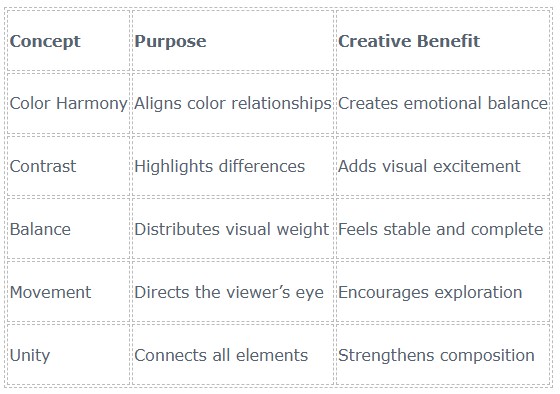
Quick Reference Table: Color and Design Essentials

Conclusion
Knowledge of color harmony and design principles for abstract painting can make the work of abstract and mixed-media painting as much a matter of guesswork as a matter of art. Once the artists learn color theory and design in mixed media painting, they become clear, free, and in control without losing creativity. These are the principles that foster artistic intuition rather than hinder it. Through the art of harmony, equilibrium, and composition, art is more emotional and expressive. For artists who want to learn more and develop more rapidly, Art and Success provides a level of professionalism that combines instinctive creative awareness with professional skills, helping an artist constantly create work that really rings.
FAQ
Does abstract painting actually need color theory?
Yes, it helps establish emotional balance and clarity of vision. Color theory informs but never creates an obstacle. Artists can use their own concepts or break rules to make their art more expressive.
Are these concepts easy to use among beginners?
Absolutely. These concepts are easy to learn and quite intuitive. These make the decision-making easier for newbies. They can make wonderful artworks.
Are design principles an obstacle to innovation?
No, they show ways in which freedom flourishes, and you develop your art. The design principles just give the structure for creativity.
FREE GUIDE
Five Must Have Studio Tools Each Under $20
Sign up now to get instant access to the free guide that reveals the 5 most important tools that I always have by my side!
We hate SPAM. We will never sell your information, for any reason.

