
Learn Color Theory and Design for Mixed Media Painting: How to Combine Color and Design in Mixed Media Painting
May 22, 2026Artists learning how to combine color and design in mixed media painting will be able to produce a balanced, emotionally captivating piece of work. In mixed media art, a number of materials, textures, painting techniques, and methods are used at the same time, so color harmony and design structure are of particular importance. Learn color theory and color design for mixed media painting to create better compositions, better focal points and more professional mixed media paintings. This guide covers vital techniques, color approaches, and design concepts that enable artists to create confident, clear, and effective visual storytelling in their modern art projects through the process of layering mixed media.
What Is Color Theory in Mixed Media Painting?
Color theory is a system of understanding how colors relate to one another, how they evoke feelings, and how they can be harmonious in art.
Mixed Media compositions are all built on color theory. Understanding color relationships becomes important in maintaining the visual integrity of the pieces of mixed media artwork when multiple paints, collage papers, textures, inks, fabrics and layered materials are utilized together. Color theory is frequently employed by artists to direct feeling, motion, focus and narrative in their painting. If you don't know how to combine color and design in mixed media painting, they can be a visual overload or seem disjointed.
Why Design Principles Matter in Mixed Media Art
Design principles are used to arrange colors, textures and shapes into meaningful arrangements. Even a very creative example of mixed media art needs a framework to help the viewer navigate the work successfully.
Essential Design Principles for Mixed Media Painting
Take a look at the principles to learn color theory and color design for mixed media painting.
1. Balance Creates Visual Stability
Balance creates an organized, comfortable feeling with artwork. Symmetrical balance is associated with calmness and order, and asymmetrical balance is associated with energy and movement. Mixed media artists may use a balance of weighty materials, intense colors and detailed focal points throughout the composition. By keeping a balance, the whole painting does not overwhelm the viewer and enables him/her to easily and with interest see all parts of the painting.
2. Emphasis Strengthens the Focal Point
A focal point is the main point of interest in a work of art. Brighter colors, sharper textures, or strong contrast help to focus attention on important areas by the artist. Effective emphasis helps the viewer avoid confusion and helps to develop a stronger narrative throughout mixed media compositions. Artists who are familiar with how to combine color and design in mixed media painting can create focal points that are clear, strong and engaging for viewers.
3. Movement Guides the Viewer’s Eye
Motion guides viewers' visual journey through the artwork. Directional flow is achieved through lines, repeated shapes, brushstrokes and color placement. When using multiple media in a painting, movement is particularly crucial because layering can lead to visual clutter. The eye is directed elegantly, and the rhythm, structure and visual flow of the composition are enhanced by strategic design decisions.
4. Unity Connects Multiple Materials Together
Mixed media art pieces may have several textures and art elements. The random feeling of all the parts is resolved by unity. The use of repeating colors, textures, patterns and spacing creates unity for artists. A uniform visual language enhances professionalism and creates an easier-to-understand and appreciate complex composition.
How to Combine Color and Design in Mixed Media Painting
Successful use of color and design is an intentional strategy, experimentation and thoughtful layering to enhance the visual story.
Start with a Limited Color Palette
One of the best ways that mixed media artists can learn color theory and color design for mixed media painting is to use only a few dominant colors in a composition. The wrong combination of colors can make for a lack of musical harmony and visual confusion. Professional artists often choose 3-5 fundamental colors before they start painting. All elements within the artwork are influenced by these colors.
Benefits of Using a Limited Color Palette
- Builds greater cohesiveness in compositions
- Avoids cluttered or exuberant colour combinations
- Enhances emotional uniformity in artworks
- Sets up focal points more easily
- Increases the visibility and interaction of texture with the material.
- Easily layer paint to get a range of finishes.
Popular Mixed Media Color Palette Examples
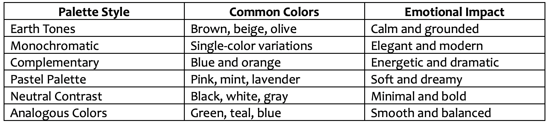
Artists who learn color theory and color design for mixed media painting will start creating with controlled color palettes and then experiment with more complicated color palettes.
Common Mistakes in Mixed Media Color Design
Mixed media painters will learn color theory and color design for mixed media painting and get better at painting faster when they learn about common artistic mistakes.
Mistake #1: Overusing Bright Colors
When too many saturated colors are used together, they may be distracting to the viewer and decrease the focal clarity. Bright colors will look more purposeful and pleasing when used in balanced neutral colors.
Mistake #2: Ignoring Negative Space
Negative space is the space in an artwork that is not taken up by the objects. Rather, if you fail to leave some gaps, mixed media paintings can look cluttered and harder to comprehend.
Mistake #3: Excessive Texture Usage
Low and medium amounts of texture are good for adding depth and interest, but too much can lead to unnecessary chaos. Controlled texture placement adds to emphasis and composition structure.
Mistake #4: Weak Value Contrast
Lacking in light and dark contrast, paintings can be lifeless and flat. Variation in values enhances the visibility of the dimension and focal point greatly.
These pitfalls can be prevented and assist the artist to make stronger, more professional, and emotionally effective mixed media pieces with more visual narrative. Art and Success lets you know how to combine color and design in mixed media painting to make the best paintings.
FAQ About Learn Color Theory and Design for Mixed Media Painting
What do you mean by a "color palette" in the context of mixed media painting?
Color palette is a list of colours that are chosen for a whole piece of work for visual consistency and for emotional impact.
Is color theory easy for beginners to learn?
Yes. For the beginner, the improvement is fast and can be accomplished by adding practical exercises with primary colors, complementary schemes and simple layering studies.
Why is texture important in mixed media art?
Layered, artistic compositions provide texture that adds visual depth, tactile interest and storytelling within.
Final Thoughts on Mixed Media Color and Design Success
When artists study color theory and painting design, they become more visually literate, have better compositional structure, and become more creative. Knowing how to combine color and design in mixed media painting empowers artists to use random experimentation as a way to communicate through color and design in painting. Strategic palette control, layering, balanced textures, and intentional focal points are used to produce artwork that has emotional appeal and professional refinement. With practice and careful consideration, mixed media artists can produce effective compositions that resonate with contemporary viewers and creative communities. Art and Success helps you learn color theory and color design for mixed media painting.
FREE GUIDE
Five Must Have Studio Tools Each Under $20
Sign up now to get instant access to the free guide that reveals the 5 most important tools that I always have by my side!
We hate SPAM. We will never sell your information, for any reason.
