
Step-by-step color and design tutorial for artists
Dec 01, 20251. Understanding Color Theory
Most online tutorials for abstract art, color, and design will focus on the color theory. This is the very basic step!
- Primary, Secondary, and Tertiary Colors:
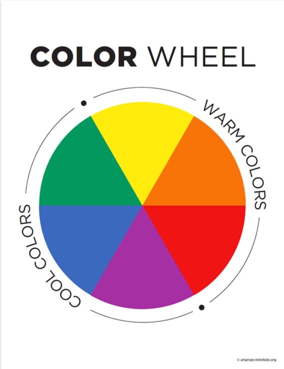
The comprehensive knowledge of the color wheel assists artists in making well-balanced palettes. The foundation colors are primary colors (red, yellow, blue), the intermediate ones are formed when the former mix, and no tertiary colors occupy the gaps. This knowledge of such relationships enables an easy mixing, specially between the various media. - Color Temperature and Emotional Influence:
The warm colors, such as reds, oranges, and yellows, are associated with energy and excitement, and cool colors, such as blues, greens, and purples, bring calm and serenity. Strategic contrast in temperature is a rhythmed addition of emotion in a composition.
Source: https://share.google/images/KNcSssbdlUzlRjJsc
- Value and Intensity Manipulation:
Manipulating the lightness (value) and saturation (intensity) of colors makes it three-dimensional and emphasised. These variations are taken by artists to guide the eyes of the viewer to focal points or to create simple transitions. - Color Harmonies and Schemes:
Complementary schemes (such as blue and orange) provide contrasting brightness, whereas similar schemes (such as green, blue-green, and blue) give a harmony. These relationships, when used carefully, guarantee cohesion. - Psychology and Symbolism of Color:
Colors convey a sense of emotion, such as red is synonymous with passion, green with renewal, and blue with calmness. Mixed media plus the application of symbolic color is stronger in the storytelling, a dialogue between the art and the viewer that is subconscious.
Artists can use color to express and convey emotion through color mastery, and it is not only an aesthetic beauty, but also an emotional one.
Being an amateur or a master of the technique, the knowledge of color and design is the foundation of creating a mixed media artwork that not only impresses the eye but also the soul.
2. Integrating Design and Emotion in Abstract Painting
Abstract painting is best when design and emotion work together.
- Emotional Intention: Each painting is supposed to start with some emotion or idea; it might be joy, solitude, chaos, or calm, and explain design decisions.
- Gestural Expression: Huge sweeps of the brush strokes communicate freedom; reserved strokes are meditative. Emotion is turned into rhythmic action by hand.
- Color as Mood Translator: The cool colors depict a sense of peace; the hot colors are used to convey passion. Emotions are enhanced by changing saturation or contrast.
- Liberty and Discipline: Liberty without purpose is chaos, and too much order loses expression. The trick consists of the ability to combine expressiveness and compositional accuracy.
- Refinement: Designers frequently go back to a work and add more and more layers, scrape away or redefine shapes until a design and emotion come together in harmony.
The skill in abstract art is in combining the heart and the mind. Once emotion drives design and vice versa, every component ought to be irreplaceable. The outcome is not just a painting that is used to decorate a wall, but one that speaks, echoes, and changes. It represents the inner world of the painter that is exposed to orderly accidentality.
3. Achieving Visual Balance and Harmony
The comfort of an abstract painting composition is determined by balance and harmony. It is quite an essential step in this step-by-step color and design tutorial for artists.
- Spatial Distribution: Visual weight- developed by size, tone, or density. The bright red square in the right corner might demand lighter colors in other parts so as to stabilize the composition.
- Proportion and Scale: The large elements prevail; the minor ones complement. The manipulation of composition keeps their relationships balanced and eliminates overcrowding of the visual work.
- Contrast as Structure: The differences in color, texture, or thickness of line bring dynamism in clarity. The contrast is controlled, and the contrast is excessive and distracting.
- Negative Space: The spaces that have not been touched or painted subtly provide the eye with a chance to take a break, giving breathing space, which increases impact. Silence, as in breaks within music, enhances expression.
- Rhythmic Balance: Like waves in the sea, it is rhythmic and alternating between calm and active parts.
Visual balance is not necessarily an aspect of absolute symmetry, but instead, it is a sense of an equitable use of energy on the canvas. Great abstract paintings throb with internal vibration- where the harmony is achieved by contrast and each form is placed in concerted purpose. Once uncovered, the audience feels the wholeness, even where there seems to be no order whatsoever.
4. Exploring Texture and Layering Techniques
Another important part of this step-by-step color and design tutorial for artists is layering and exploring texture!
- Material Variety: Mixed media is based on the notion of using paint, fabric, and paper and creating visual and physical depth.
- Layering Depth: Multicolored glazes or multiple glazes in layers are used to provide depth, which provides a conversation between the background and the surface.
- The Emotion of Texture: Rough scraped textures can be a representation of conflict, and smooth gradients can be a representation of serenity.
- Subtractive and Additive Play: Artists have the ability to add and take away materials to uncover concealed colors and shapes to tell a narrative.
The texture is not just a feature of surfaces, but it is a language, it is a language of emotion and structure. Artists create depth in the image and tension in the story through conscious overlaying. The rhythm of the composition is a contribution of all media, acrylic, pastel, or collage. The time and change are caught in the texture, and this shows the hand of the artist as well as the development of the painting.
5. Developing a Personal Color and Design Style
Follow step-by-step color and design tutorial for artists, but don't forget to develop your signature style!
- Determine Patterns of Emotion: Notice patterns of colors or shapes that conform to your emotions.
- Get Bold: Go beyond expected color combinations. Be it temperatures, new textures, or odd media pairings.
- Practice by Refining: Examine what compositions are authentic. Note down a journal of visual choices of colors and layouts.
- Coherence with Changeability: There will be repetitive themes in your art as time goes by. Accept these, but leave to evolve.
Creating your own color and style of design is a journey that is discovered. It is concerning the translation of technical knowledge into an instinctive manifestation. When artists grow up, the palette and rhythm of composition become an inherent development, and an identity is manifested in abstraction. It is this combination of talent, intuition, and feeling that makes familiar and catchy art.
Online tutorials for abstract art color and design from Art and Success focus on this!
Table: Color and Design Essentials for Artists
|
Element |
Purpose |
Artistic Application |
|
Color Temperature |
Defines emotion |
Warm = passion, Cool = calm |
|
Contrast |
Adds focus |
Oppose light and dark areas |
|
Texture |
Creates depth |
Layer fabrics, paper, paint |
|
Negative Space |
Balances composition |
Use unpainted areas as visual rest |
|
Harmony |
Ensures cohesion |
Combine analogous or complementary tones |
Conclusion
Abstract art is one that lives on the relationship among color, design, and emotion. Every judgment, hue, form, or texture adds to the perception and the sensation felt by the viewers of the piece of art. Mastering the rules of color theory and composition will make artists act not intuitively, but as planners. The elements of harmony and contrast are harmonious and in the same frame, they generate energy and peace. Finally, each brush stroke denotes some interior discourse between structure and feeling, reason and passion. Experts in the art of design and color create works that not only satisfy the eye but also evoke the soul, making a vision into the eternal visual poetry. Check out the online tutorials for abstract art color and design by the experts at Art and Success!
FAQs
Q1: Why is color important in abstract art?
A: Color expresses mood, emotion, and structure, guiding the viewer’s emotional journey.
Q2: How can balance be achieved in design?
A: By managing contrast, proportion, and negative space to distribute visual weight.
Q3: What role does emotion play?
A: Emotion informs every design decision, ensuring authenticity and depth.
FREE GUIDE
Five Must Have Studio Tools Each Under $20
Sign up now to get instant access to the free guide that reveals the 5 most important tools that I always have by my side!
We hate SPAM. We will never sell your information, for any reason.
